Saturday 17 October 2015

Graph 30

In June 1996, an experimental flu vaccine was trialled in a large country town on females only.

Summarise the information by selecting and reporting the main features, and make comparisons where relevant.
You should write at least 150 words.

Give reasons for your answer and include any relevant examples from your own knowledge or experience.
IELTS Writing Test
IELTS Writing Test
IELTS Writing Test
model answer:
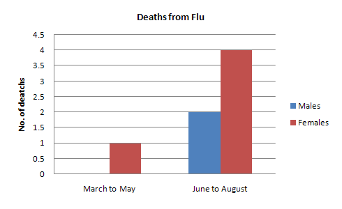
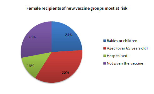
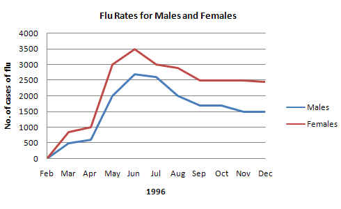
The diagrams show data for a flu epidemic which hit a large country town in 1996. Figure 1 gives the number of persons who died; Figure 2 shows the percentage breakdown of females who received a new flu vaccine; and Figure 3 gives the number of cases of flu before and during the epidemic.

In Figure 1 it can be seen that the flu was responsible for the deaths of 2 females but no males in the period from March to May. However, from June to August, there were 4 female deaths and 1 male death.

According to the pie chart in Figure 2, only those females most at risk were given the new flu vaccine; 28% did not take part in the trial. Of those females who took part, 35% were aged (over 65 years old); 24% were babies or children; and 13% were either hospitalised or receiving other medical attention.

From Figure 3 it is clear that the new vaccine had a positive effect on the number of new cases of flu reported in females. There were just over 1000 cases reported in March, climbing rapidly to a peak of 3500 in June. Thereafter, the number of cases dropped slowly to about 2800 in August, before levelling off at 2500 for the rest of the year. For males, the figures were lower but showed a similar trend throughout the epidemic.

Graph 29

The table below shows the sales at a small restaurant in a downtown business district.

Summarize the information by selecting and reporting the main features, and make comparisons where relevant.
You should write at least 150 words.

Give reasons for your answer and include any relevant examples from your own knowledge or experience.

Sales: week of October 7-13

 Mon.Tues.Wed.Thurs.Fri.Sat.Sun.
Lunch$2,400$2,450$2,595$2,375$2,500$1,950$1,550
Dinner$3,623$3,850$3,445$3,800$4,350$2,900$2,450

Model answer

The sales at this small restaurant during the week of October 7 to 13th followed a fairly set pattern from Monday to Friday, and then showed notable shift on the weekend. The lunch and dinner sales during the week peaked on Friday and then dipper down as the weekend set in.

During the week of October 7-14th, the lunch sales averaged at approximately $2,400. The highest lunch sales occurred on Friday, and the lowest occurred on Sunday. Sunday's lunch sales were approximately $1,000 less than the average lunch sales during the rest of the week.

Dinner sales, which generated at least $1,000 to $1,500 more a day than lunch sales, also remained steady during the week. Just like the lunch sales, the dinner sales peak on Friday and dipped down for the weekend.

Excluding Wednesday and Thursday, the lunch and dinner sales from October 7-11 rose gradually until the end of the business week. Midweek, on Wednesday and Thursday, the sales were slightly lower than they were on Tuesday.

According to the sales report, this restaurant has a steady lunch and dinner crowd. The most profitable day during the second week of October was Friday. Sunday, was the least profitable day, with the full day's sales totaling/totalling less than the Friday dinner sales. These numbers are reflective of a restaurant that is located in a business/financial district where business hours are Monday through Friday.

Graph 28

The flowchart below shows the process involved in completing the work experience requirement for university students.

Summarize the information by selecting and reporting the main features, and make comparisons where relevant.
You should write at least 150 words.

Give reasons for your answer and include any relevant examples from your own knowledge or experience.
Fulfilling the Work Experience Requirement
Credits will be awarded when the final report is submitted.

Application
Choose potential workplaces from approved list and arrange interviews. Submit applications to places of interest.
IELTS
Approval
When acceptance letter is received, submit it to professor for approval.
IELTS
Schedule
Arrange schedule to work a minimum of 10 hours/ week over 20 weeks.
IELTS
Reports
Complete weekly Report Form and submit to professor every Friday.
IELTS
Evaluation
During final workweek, participate in evaluation meeting with work supervisor. Supervisor submits Evaluation Form.
IELTS
Final Report
Submit Final Report before last week of spring term.
model answer:
Gaining work experience prior to graduation helps university students to succeed in getting their first job. For this reason, some universities insist that all students must complete a Work Experience Requirement. Completing the following six stages results in the requirements’ fulfillment.

The process begins with the Application stage. A student reviews an approved list of workplaces and submits applications to places where he would like to work. Next is the Approval stage. When a student receives an acceptance letter, he gives it to the professor for approval. The third stage, Schedule, requires a student to arrange his work schedule. The student should work at least 10 hours/week over 20 weeks. Reports are next. The student must complete a Weekly Report Form and turn it in to the professor every Friday.

The fifth stage, Evaluation, takes place during the final work week. A student participates in an evaluation meeting with his work supervisor, who submits an Evaluation Form. The last stage requires that a student submit a Final Report before the last week of spring semester.

By following these stages and subsequently submitting the final report, the student receives credit from the university.

Graph 27

The Bar Chart shows CO2 emissions for different forms of transport in the European Union.

The Pie Chart shows the percentage of European Union funds being spent on different forms of transport.
You should write at least 150 words.

Give reasons for your answer and include any relevant examples from your own knowledge or experience.
IELTS

IELTS
model answer:
The chart shows CO2 emissions per passenger kilometre for variuos methods of transport in the European Union while the pie chart shows European Union spending on transport. Flying by air produces by far the greatest CO2 emissions, approximately three times as much as passenger cars which are the next largest producers. Very little is spent by the EU on air travel while roads make up more than half of the EU transport budget.

Trains produce about three times less CO2 emissions per passenger kilometre than passenger cars and eight times less than air travel. Nearly a third of EU transport funds are spent on railways.

Ships are a clean form of transport and produce about the same amount of CO2 per passenger kilometre as trains do. However, only 2 percent of EU funds are spent on ports. A further one percent is spent on inland waterways.

Coaches are the cleanest form of transport. Emissions of CO2 per passenger kilometre from coaches are half those of buses. Buses emit less than half as much CO2 per passenger kilometre as cars. The European Union spends 10 percent of its transport budget on public transport, such as buses and coaches.

Graph 26

The charts below show the percentage of their food budget the average family spent on restaurant meals in different years. The graph shows the number of meals eaten in fast food restaurants and sit-down restaurants.
You should write at least 150 words.

Give reasons for your answer and include any relevant examples from your own knowledge or experience.
IELTS Writing Task 1
IELTS
model answer:
Over the past 30 years, the average family has dramatically increased the number of meals that they eat at restaurants. The percentage of the family's food budget spent on restaurant meals steadily climbed. Just 10 percent of the food budget was spent on restaurant meals in 1970, and 15 percent in 1980. That percentage more than doubled in 1990, to 35 percent, and rose again in 2000 to 50 percent.

Where families eat their restaurant meals also changed during that 30-year period. In 1970, families ate the same number of meals at fast food and sit-down restaurants. In 1980, fam¬ilies ate slightly more frequently at sit-down restaurants. However, since 1990, fast food restaurants serve more meals to the families than do the sit-down restaurants. Most of the restaurant meals from 2000 were eaten at fast food restaurants. If this pattern continues, eventually the number of meals that families eat at fast food restaurants could double the number of meals they eat at sit-down restaurants.

Graph 26

The graph below compares the number of visits to two new music sites on the web.

Write a report for a university lecturer describing the information shown below.
You should write at least 150 words.
IELTS Writing Task 1
model answer 1:
The graph shows the number of hits to two new music sites on the web, measured in thousands over a period of fifteen days. As far as Music Choice is concerned, the number of visits to the Site fluctuated between 20,000 and 40,000 in the first eleven days, except for Day 3 when they reached 60,000. By contrast, visits to the Pop Parade Site fell erratically from approximately 120,000 hits on Day 1 to around 40,000 on Day 7.

Between days 11 and 15 visits to Music Choice fluctuated dramatically, hitting a peak of over 120,000 on Day 14. Despite a drop to less than 40,000 hits, Pop Parade Saw a huge increase in the number of hits between Days 9 and 11, reaching a total of over 150,000 hits on Day 11. At the end of the fifteen-day period the number of hits to Pop Parade peaked at around 170,00, whereas those for Music Choice Showed a marked decline to around 70,000.
(163 words)
model answer 2:
The graph shows people using new music places on the Internet in fifteen days period of time namely personal choice and trendy pop music.

The overall trend shows fluctuation with slight Increased towards the end of the period.

Starting with Music Choice websites; 40,000 poeple went on this new site on first-day. Half of them backed out the next day. In Contrast to this Pop Parade net sites were visited by 120,000 music lovers on day one which decreased slightly on the next day thereafter regaining the same fame on 3rd day.

After 3rd day the enthusiasm for both music lines on Internet dropped slowly- reaching maximum fall of 40,000 on 7th day. Whereas Music choice gained popularity, slightly Improoving to get the original strength of 30,000 viewers on screen, but was getting still less visiters than their opponent Pop group i.e. 40,000 on day 7.

In the biegining of the next week both gained remarkable recovery after a few fluctuations for 8th and 9th day having 40,000 and 50,000 visiters respectively, reaching to their peaks of one and a half thousand new viewers for Pop Parade on 11th day showing a contrast of very few people visiting Music choice for the same day. Thereafter Music choice gained popularity on 12th day for having more than 120,000 new visiters on web.

In the end of the period Pop sites were visited by maximum viewers of 180,000 whereas sites located to Music choice were not explored by more than 80,000 explorers on the last day of the report.

Graph 25

The bar chart below shows the results of a survey conducted by a personnel department at a major company. The survey was carried out on two groups of workers: those aged from 18-30 and those aged 45-60, and shows factors affecting their work performance.

Write a report for a university lecturer describing the information shown below.
You should write at least 150 words.
ielts graph
model answer:
The bar chart indicates a survey on two different age groups on the factors contributing to make their environment pleasant for working.

These factors are divided into external and internal factors. The internal factors are team spirit, competent boss, respect from colleagues and job satisfaction. The external factors are chance for personal development, job security, promotional prospects and money.

On the internal factors above 50% in both age groups agreed that team spirit, competent boss and job satisfaction are essential to make their environment pleasant. Whereas on the external factors, there are contrasting results. On the chance for personal development and promotional aspects, 80% to 90% of the younger groups were in favor while only less than 50% of the older group thought so. A similar pattern is also noted on job security. With regards to money, 69% to 70% on both age group said it is essential.

In conclusion, the internal factors have similar responses from the two age groups while they had dissimilar responses on the external factors.

Graph 24

The graph below gives information about the preferred leisure activities of Australian children.

Write a report for a university lecturer describing the information shown.
You should write at least 150 words.
IELTS
model answer:
The graph shows the preferred leisure sctivities of Australian children aged 5-14. As might be expected, it is clear from the data that sedentary pursuits are far more popular nowadays than active ones.

Of the 10,000 children that were interviewed, all the boys and girls stated that they enjoyed watching TV or videos in their spare time. In addition, the second most popular activity, attracting 80% of boys and 60% of girls, was playing electronic or computer games. While girls rated activities such as art and craft highly – just under 60% stated that they enjoyed these in their spare time – only 35% of boys opted for creative pastimes. Bike riding, on the other hand, was almost as popular as electronic games amongst boys and, perhaps surprisingly, almost 60% of girls said that they enjoyed this too. Skateboarding was relatively less popular amongst both boys and girls, although it still attracted 35% of boys and 25% of girls.

Graph 23

The graph and table below give information about water use worldwide and water consumption in two different countries.

Summarise the information by selecting and reporting the main features, and make comparisons where relevant.
Write at least 150 words.
IELTS
CountryPopulationIrrigated landWater consumption per person
Brazil176 million26,500 km²359 m³
Democratic
Republic
of Congo
5.2 million100 km²8 m³

Model answer

The graph shows how the amount of water used worldwide changed between 1900 and 2000.

Throughout the century, the largest quantity of water was used for agricultural Purposes, and this increased dramatically from about 500 km³ to around 3,000 km³ in the year 2000. Water used in the industrial and domestic sectors also increased, but consumption was minimal until mid-century. From 1950 onwards, industrial use grew steadily to just over 1,000 km³, while domestic use rose more slowly to only 300 km³, both far below the levels of consumption by agriculture.

The table illustrates the differences in agriculture consumption in some areas of the world by contrasting the amount of irrigated land in Brazil (26,500 km³) with that in the D.R.C. (100 km²). This means that a huge amount of water is used in agriculture in Brazil, and this is reflected in the figures for water consumption per person: 359 m³ compared with only 8 m³ in the Congo. With a population of 176 million, the figures for Brazil indicate how high agriculture water consumption can be in some countries.

Graph 22

Write a report for a university lecturer describing the information shown below.
You should write at least 150 words.
IELTS Writing
model answer:
In this analysis we will examine three pie charts. The first one is headed ‘World Spending.’ The second is ‘World Population’ and the third is ‘Consumption of Resources.’

In the first chart we can see that people spend most of their income (24%) on food. In some countries this percentage would obviously be much higher. Transport and then housing are the next major expenses at 18% and 12% respectively. Only 6% of income is spent on clothing.

In the second chart entitled ‘World Population’, it is not surprising to find that 57% of people live in Asia. In fact China and India are two of the most populated countries in the world and they are both situated on this continent. Europe and the Americans account for nearly 30% of the total, whilst 10% of people live in Africa.

Finally, the third chart reveals that the USA and Europe consume a huge 60% of the world’s resource.

To sum up, the major expenditure is on food, the population figures are the highest for Asia and the major consumers are the USA and Europe.

Graph 21

The graph below shows the differences in wheat exports over three different areas.

Write a report for a university lecturer describing the information shown below.
Write at least 150 words.
IELTS Writing Task 1

Model answer

The three graphs of wheat exports each show a quite different pattern between 1985 and 1990. Exports from Australia declined over the five-year period, while the Canadian market fluctuated considerably, and the European Community showed an increase.

In 1985, Australia exported about 15 millions of tonnes of wheat and the following year the number increased by one million tonnes to 16 million. After that, however, there was a gradual decline until 1989 and 1990 when it stabilised at about 11 million tonnes. Over the same period, the amount of Canadian exports varied greatly. It started at 19 million tonnes in 1985, reached a peak in 1988 of 24 million, dropped dramatically in 1989 to 14 million tonnes and then climbed back to 19 million in 1990. Seventeen million tonnes were exported from the European Community in 1985, but this decreased to 14 million tonnes in 1986 and then rose to 15 million in 1987 and 1988 before increasing once more to 20 million in 1990.

Graph 20

The two graphs show the main sources of energy in the USA in the 1980s and the 1990s.

Write a report for a university lecturer describing the changes which occurred.
Write at least 150 words.
IELTS Writing Task 1

Model answer

The two graphs show that oil was the major energy source in the USA in both 1980 and 1990 and that coal, natural gas and hydroelectric power remained in much the same proportions. On the other hand, there was a dramatic rise in nuclear power, which doubled its percentage over the ten years.

Oil supplied the largest percentage of energy, although the percentage decreased from 42% in 1980 to 33% in 1990. Coal in 1990 was the second largest source of energy, increasing its proportion to 27% from 22% in the previous decade. Natural gas, the second largest source in 1980 at 26%, decreased its share very slightly to provide 25% of America’s energy ten years later. There was no change in the percentage supplied by hydroelectric power which remained at 5% of the total energy used. Nuclear power the greatest change: in 1990 it was 10%, twice that of the 1980s.

Graph 19

The chart shows student expenditure over a three-year period in the United Kingdom.

Summarise the information by selecting and reporting the main features, and make comparisons where relevant.
Write at least 150 words.
Student expenditure (aged under 26 in higher education) United Kingdom*
IELTS Writing Task 1
Percentage of total expenditure
(1) includes non-essential consumer items and credit repayments
* Source: Student Income and Expenditure Survey. Department for Education and Employment.
Study these three sentences and then write three similar sentences about other parts of the chart.
1) During the period 1996 to 1999, student spent 3% less on accommodation, which fell from 23% to 20% of total expenditure.
2) There was a 3% decrease in spending on accommodation, which fell from 23% to 20%.
3) Spending on accommodation went down by 3% from 23% to 20%.

Using prepositions

Complete the following sample report by putting a preposition in each space.
The chart shows the changes which took place .................... student spending in the United Kingdom .................... the three-year period from 1996 to 1999.

Students spent 3% less on accommodation, which fell .................... 23% .................... 20% of total expenditure, and there was a 2% decrease .................... spending on food, bills and household goods, which fell from 20% to 18%. At the same time course expenditure went down.................... 3% from 10% to 7%. Children, who constituted 1% .................... students' expenditure in 1996, are not represented in 1999.

On the other hand, there was a 5% growth .................... spending on entertainment, which stood.................... 26% of total expenditure in 1996 but rose .................... 31% in 1999. Spending on other non-essential items and credit repayments grew .................... 4% to make ....................16% of total expenditure. Spending on essential travel went up .................... 3% while non-essential travel underwent a 1% fall.

Overall, with the exception of expenditure .................... travel, the most significant general change was a shift .................... spending on essential items .................... spending on non-essential items.

Graph 18

The chart shows the division of household tasks by gender in Great Britain.

Summarise the information by selecting and reporting the main features, and make comparisons where relevant.
Write at least 150 words.
IELTS Writing Task 1
Source: Office for National Statistics on behalf of the Controller of Her Majesty's Stationery Office.
Study these three sentences and then write three similar sentences about other parts of the chart.
1) Women spend over twice as much time doing kitchen tasks as men.
2) Men spend 30 minutes a day doing kitchen tasks whereas / while women spend 74 minutes a day.
3) Women are more active in the kitchen than men (74 minutes a day for women as opposed to 30 minutes for men).

Sample Report

Look at the following sample answer to the writing task. Write a word in each space.
The chart shows the average number of minutes per day men and women in Great Britain spend on jobs around the house.

In total, men spend just .................... two-and-a-half hours on household tasks whereas women spend slightly .................... than four hours. Women spend more than .................... as much time doing kitchen tasks such as cooking and washing up .................... men (74 minutes for women as opposed .................... 30 minutes for men. Women are also more active in cleaning the house- it takes 58 minutes of their day compared .................... 13 minutes for men - and childcare, where women put in more than twice as .................... time as men.

On the other hand, men are .................... active in gardening and pet care, where they spend twice as .................... as women, and maintenance and DIY, on which they spend 15 minutes more.................... women. Women account for almost all the time spent on washing and ironing clothes. This takes them 25 minutes, .................... men spend just 2 minutes on this task.

Overall the figures show that women spend more time on routine domestic chores than men,.................... men do more household maintenance, gardening and pet care.

Graph 17

The graph below shows radio and television audiences throughout the day in 1992.

Write a report for a university lecturer describing the information shown below.
Write at least 150 words.
IELTS Writing Task 1

Model answer 1

The graph shows the percentage of audiences over 4 yes old of UK follows the radio and television throughout the day during the period October-December 1992. It has been observed from the graph that less than 10% audiences follows the radio at 6:00 am and the percentage raised to a pick around 30% at 8′AM and decline gradually to around 10% during the period 2′00 to 4′00 Pm and again raised a bi t to around 12% between 4′00 to 6′00 PM. It then again dropped to below 10% at around 10′PM. The rate again raised to a bit between 10′00 PM to 12′00 PM and then dropped slowly by 4′00 AM. On the other hand, the rate of television audiences raises 0-10% during the period 6′00 to 8′00 am and remain steady up to 1 0′AM and then gradually goes down by 12′00 noon. The percentage raised dramatically to around 15% by 2′00 noon. The percentage raised dramatically goes down by 12′00 noon. The percentage raised dramatically to around 15% by 2′00 PM which again raised to a pick above 40% between 6′00-8′00 PM and then gradually dropped between the period 12′00 PM to 4′00 AM.

Graph 16

The graph below shows the unemployment rates in the US and Japan between March 1993 and March 1999.

Write a short report for a university lecturer describing the information shown below.
You should write at least 150 words.
IELTS Writing Task 1

Model answer

According to the results of the labor-force research published recently, the following conclusions can be drawn from it:

In March, 1993, United States had seven percent of their workforce which might not seem disastrous until compared with Japan, where 2.5% were unemployed. However, the unemployment rate in United States began declining slowly since March 1993, and reached 5% mark in the middle of 1996. Japan turned out to be less lucky, as their unemployment rate doubled in three years. From then on, the percentage of unemployed workforce in United States remained roughly the same — about 5% until March 99, although there were minor falls and rises in the unemployment rate.

As for Japan, the percentage of unemployed fell rapidly by 0.5—0.6% after March 1996, but from summer 1996 and onwards it grew steadily and without any falls to reach 5.0% boundary in March 1999.

The major conclusion that I've drawn using the graph, is that number of unemployed in USA decreased by about 2.0% in the course of six years, while in Japan it actually increased by 2.5%. As a result, in March 99, both Japan and US had about 5% of their work force unemployed.

Graph 15

The graph below shows the demand for electricity in England during typical days in winter and summer. The pie chart shows how electricity is used in an average English home.

Summarise the information by selecting and reporting the main features and make comparisons where relevant.
You should write at least 150 words.
IELTS Graph

Model answer

The Demand for electricity in England during typical days in winter and summer is illustrated in the graph. The use of electricity in an average English home is shown in the pie chart. From the graph it is generally obvious that the demand is in its maximum around 2100 in winter times and in its minimum around 400 being almost constant between 1200 and 2100 in winter times. During summer times on the other hand the demand reaches its top point around 1300 and the bottom point around 900 being almost constant between 1550 and 2000.

In wither times the curve gradually increases to reach 40000 units of electricity by 3 o’clock in the morning. This is followed by gradual decline to its lowest limit of 30000 units at 9 o’clock. A gradual rise is obvious again to reach a stationary level between 3 o’clock and 9 o’clock of about 40000 units again. Then there is a sharp rise in the next hour to reach its maximum before collapsing again to a lower level by the end of the day.

In summer time the curve gradually decrease to reach its lower limit around 9 o’clock of a bit more that 10000 units. A gradual increase is noticed to reach its top of 20000 after which a stationary phase is obvious between 3 o’clock and 10 o’clock at night of about 15000 units.

The pie chart on the other hand shows that 52.5% of the electricity is used for heating rooms and water. 17.5% is consumed for ovens kettles and washing machines 15% is used in lighting TV and radio and finally 15% is consumed in the sue of vacuum cleaners food mixtures and electric tools.

Graph 14

Vocabulary in the report

The charts A and B show the share of the UK and Australian cinema market in 2001 and cinema admission in the UK and Australia from 1976 to 2006.
IELTS Writing Task 1

Sources: Admission data: BFI, Motion Picture Distributors Association of Australia (MPDAA).
Read this sample report and fill each space by choosing one of the words in the box.
accountedcompareddropped
stoodfellincreased
opposedpredominatedrecovered
Chart (A) shows the cinema industry’s share of the Australian and UK cinema market by origin in 2001. In both countries, films made in the United States .................... with 77% of the market in the UK .................... to 67% in Australia. UK films .................... for 21% of the UK cinema market and 6% of the Australian market. On the other hand, while 11% of the films shown in Australia were Australian, no Australian films were shown in the UK. Films from other countries had 16% of the market share in Australia as .................... to just 2% in the UK.

Chart (B) shows cinema admissions in the UK and Australia since 1976. In both countries cinema admissions .................... in the early 1980s. In Australia admissions ....................from just under 40 million in 1980 to about 30 million in 1984–6 while in the UK the decrease was far more dramatic (from 100 million in 1980 to less than 60 million in 1984). Since then, however, the industry has .................... in both countries. In 2001, cinema admissions in the UK.................... at over 150 million, whereas in Australia they reached 90 million.

Overall, the charts show that the cinema has .................... in popularity in both countries over the last 15 years, but that the origins of the films projected in Australia are more diverse than in the UK.

Graph 13

The chart below shows male and female fitness membership between 1970 and 2000.

Summarise the information by selecting and reporting the main features, and make comparisons where relevant.
Write at least 150 words.

IELTS Writing Task 1

Model answer

The chart shows male and female fitness membership over a thirty-year period. The vertical axis represents the number of members. The horizontal axis represents the period from 1970 to 2000.

Overall, the chart indicates that there were greater fluctuations in fitness membership among men than among women. The number of male members started the period at just over two thousand and reached highs of four thousand in 1975 and five thousand around 1995. The lowest rates were in 1985 and more recently in 2000 when the rate dipped as low as one thousand.

Female fitness membership began lower at one thousand, doubled by 1975, and then fluctuated between two and three thousand for the remainder of the period. When male rates were at their lowest, female rates were higher. This was particularly true in 1985 when over three thousand women held fitness membership.

In brief, there were marked differences in rates of male and female fitness memberships in the period covered.

Graph 12

The chart below shows the percentage of total US population aged 65 and over between 1900 and 2000.

Summarise the information by selecting and reporting the main features, and make comparisons where relevant.
Write at least 150 words.

IELTS Writing Task 1

Model answer

The chart shows the percentage of total population aged 65 and over in the U.S. between 1900 and 2000. In the year 1900 just over 4% of the population was aged over 65. However, by 1960 this figure had doubled.

The number of people aged between 75 and 84 remained fairly steady between 1900 and 1930, making up only 1-1.3% of the population. The figure began to rise more significantly in 1940 and by 1970 it had tripled to reach 3% of the population.

Although there was no change in the number of people aged 65 -74 between 1960 and 1970, the number of people aged 75 and over increased during this time. By the year 2000, 12.4% of the US population had reached the age of 65 or more, although this was slightly lower than in 1990 when it peaked at 12.6%.

The chart shows that today people in the U.S. can expect to live longer than in 1900. By the year 2000 more than 12% of the population had managed to live to the age of 65 and over compared to only 4.1% in 1900.

Adjective or Adverb?


Adjective or Adverb?

Complete the answer by filling the gaps with an adverb or adjective from the box below.
dramaticdramaticallyimpressiveimpressively
slightslightlysteadysteadily
sharpsharplysteepsteeply
IELTS Writing Task 1
The world population grew .................... between 1960 and 2000.

The world population experienced a .................... growth between 1960 and 2000.


IELTS Writing Task 1
European City Tourism showed an .................... growth of 50% for three consecutive years from 2006 to 2008.

European City Tourism grew .................... by 50% for three consecutive years from 2006 to 2008.


IELTS Writing Task 1
Diesel consumption showed a .................... increase between 2010 and 2011.

Diesel consumption increased .................... between 2010 and 2011.


IELTS Writing Task 1
Consumption of chocolate fell .................... between 1970 and 2010.

There was a .................... fall in consumption of chocolate between 1970 and 2010.


IELTS Writing Task 1
Worldwide sales of CD-ROM drives climbed .................... during the first half of the year before falling .................... in August.

There was a .................... climb in worldwide sales of CD-ROM drives during the first half of the year before a .................... fall in August. 

Graph 11

The chart below shows the GDP growth per year for three countries between 2007 and 2010.

Summarise the information by selecting and reporting the main features, and make comparisons where relevant.
Write at least 150 words.

IELTS Writing Task 1

Model answer

The chart shows the annual GDP growth for three countries from 2007 to 2010.

By the year 2007 the figure for Tunisia was by far the highest at close to 6.3% per annum. This figure is double that of Ecuador and three times that of Japan on a global level.

However by 2008 this trend has changed considerably; the Japanese doubled their annual GDP over this period and there was also an increase in the GDP of Ecuador, while Tunisia fell to 4.5% per year. In 2009 and 2010, the downward trend for Tunisia continued falling to a low of 3% at the end of this period.

For Ecuador, the GDP fell sharply to just under 1.5% in the year 2009 and rose only slightly in 2010 to 2.3%. On the other hand, for Japan, the GDP figure rose significantly throughout this time and by the year 2010 had more than matched the GDP figures for Tunisia of the year 2007.

Friday 16 October 2015

Class Test 1


PRANTIK
Performance Test on English Paper II
Class IX

1.      Transform the following sentences as directed.                                                  10 Marks
a.        How are you? (Make it assertive)
Ans............................................................................................................................................................
b.      Do or die. (Make it assertive)
Ans............................................................................................................................................................
c.       What a nuisance! (Make it assertive)
Ans............................................................................................................................................................
d.      What a coward you are! (Make it assertive)
Ans............................................................................................................................................................
e.       Don’t do it. (Make it assertive)
Ans............................................................................................................................................................
f.       You cannot but be there. (Make it affirmative)
Ans............................................................................................................................................................
g.       You must not mock the struggling students. (Make it affirmative)
Ans............................................................................................................................................................
h.      She is the nicest baby I have ever seen in my life. (Make it negative)
Ans............................................................................................................................................................
i.        I have nothing but a few antiques. (Make it affirmative)
Ans............................................................................................................................................................
j.        Please sit beside me and soothe my mind. (Make it assertive)
Ans............................................................................................................................................................

2.      Exercise on Question Tags:                                                                           10 Marks
a.       How awesome the players, ___________________?
b.      Be there and catch him, ______________________?
c.       Let him come in, ___________________________?
d.      I will will this land for this mosque, _____________?
e.       I need not go, ______________________________?
f.       I don’t need to go, __________________________?
g.       Let’s just inform her, ________________________?
h.      Let’s let him let the room, _____________________?
i.        Obey your parents, __________________________?
j.        The ‘the’ is the definite the, ____________________?
Visit us: www.ssc-hsc-english.blogspot.com; Hello: 01815420358 (SMS ONLY!)
Be with Yeasir Sir, be a boss of English!

TOTAL COUNTRIES

Flag Counter